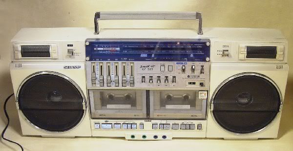
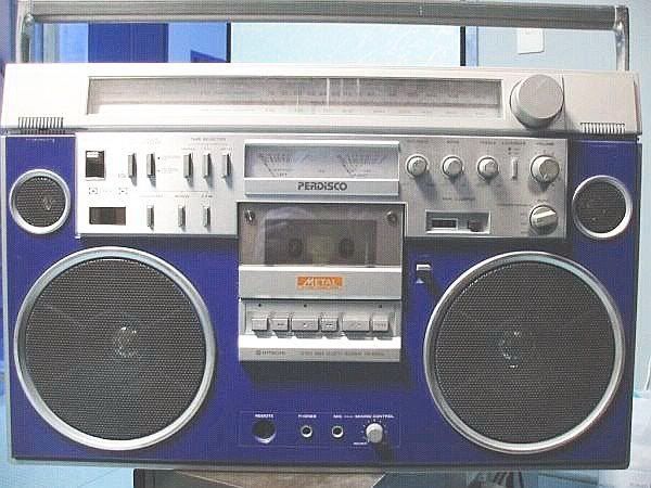
We all have our favourite boxes but which design elements annoy you.
For me, I have the following asthetical grumbles...
1. M70 - Lovely slider layout but on the right the FM, MW, LW etc buttons seem too large and spaced out to fill the pannel.
2. Big Sharp GFs - Cassette transport controls, that big 'stop' button.
3. GF 9696 - Tiny 7-segment LED VUs, why aren't these meters like the 9494?
pretty much any radio that has only one aerial should have two.
gf9000 for example
AO -agree re your #3
also --the m90 with 10 inchers might have been swell

1- Silver boxes that would have looked better in black
2- Black boxes that would have looked better in silver
3- Fake tweeters
......... to be continued.....
1. The "SILVER" box with black speakers.

(like babyboomers´)
2. The MARS JR500, instead the program search function a second deck

3. The LASONIC ipod with real radioscale, instead the fake. And double antenna

4. The technology of the strange SHARP (back to back tape, spectrum analyzer) in a pretty looking box.

quote:
Originally posted by ViennaSound:
1. The "SILVER" box with black speakers.(like babyboomers´)
HEY!!! I saw that! Watch your
tongue... typing fingers!
Design niggles:
Little speakers in big speaker housings.
Power buttons. I leave them on after listening to tapes, draining the batteries. Tape/off positions on function switches work better for me.
Plastic lattice-work speaker grilles, like on the M60 and M80. Metal screens look so much more high-end (to me).
Fake analog radio dial. (Applies to i931 only.)
(Actually, just about everything else on the i931, too.)
transamguy1977 - 2009-01-20 17:27
Any box with no controls on top with a full length handle totally bothers me.
Square mesh grilles on top of beautiful round chrome trims .
Can't looking at boomboxes with black dust cap, To me it kills the 80's appearance, But with the Panasonic RX-680 which it had gold dust caps like the tweeters instead of the black ones. I agree with BB small speakers on a big housing like the Conion TC-555.
1: Phono in but no proper line-in.
2: 3pieces with insufficient/ineffective storage for each speaker's wire, making it look a complete mess from behind.
3:ANY speaker mesh that isn't a circular metal design. The plastic lattice mesh rubbish that Baby Boomer mentioned is especially offensive.
4: Doubling up button functions instead of giving the function it's own dedicated button.
5: Like Agent Orange says too: pissweak LED meters. Especially ones that don't even have both channels. A 5 segment single line of LED's does not a meter make! On a similar note, displays that have big bold text saying FM STEREO INDICATOR LED and all manner of lines pointing to a single little red LED.
6: Music search/program mechs that allow volume through while scanning. That's just awful, and ruins the magical illusion of how it works entirely.
Rock On.
my kaboom
make it three feet wide and a foot tall and rectangular.
way too much repetitive grey and black --
more color options would have been interesting--


they are cool ira. really like the blue one.
i would love to see a m9998k in red.
or a m90 in black.
bill - i wish either/both of those were mine --
just cool shots from the base

quote:
HEY!!! I saw that! Watch your tongue... typing fingers!
Hahaaa, that´s right.


About the 931i:
I would insert a vertical CD-player instead the ipod. As "cheap" version of it...

Some interesting answers, all correct of course, though I'm not sure about the blue Perdiscco point Ira. Boomboxes should be grey and black, DEMS' THE RULES !!!
Some more of mine...
Not just a boombox thing but I get frustrated by manufacturers attempts to re-brand stereo enhancement.
3D, Biophonic, surround sound, sound expander, 'wide'....fu***ing 'Wide'anyone?
Also, so bad they're funny but what about frequency response graphs to fill bare panels.
Or, not just piss poor LED meters but meters with segments placed in a graph.....oh lordy.
Things I dislike about certain models.
1. Odd number of batteries like 5 or 9. Why couldn't they make the have 6 or 10. Sanyo and Aiwa has several boxes like this.
2. Logic or soft touch cassette controls. I like the good old reliable mechanical finger power. More reliable and less persnickidy.
3. Small chrome speaker centers are ugly (IMHO)
4. Those stupid newer figure 8 style plugs (panasonic style) who invented that joke. The old fashioned oval style works just fine.
5. Slider controls, YUK!

I dont like
1. square speaker grills with foam between the speaker and the grill like on Hitachi 3D9. I think the designer wants a technostyle but everything looks too flat without visible speakers behind the grilles
2. EQ-Sliders that look like 2 Sliders. You get a 3-Band EQ that looks like a 6-Band. Thats poor design.
3. This wrinkles on the side and back of almost every boombox I own. They look like vent holes, but most of them are not. A pain in the a** when you have to clean a dirty box.
Calling the loudness control "loudness." It's not a volume control; it's a bass boost! And why make it switchable? Who listens to their boombox with the loudness switch (if it has one) off? In the "off" position, you might as well be listening to a pocket transistor radio!
YUK I hate individual volume controls. Heck even the balance control is a waste of time.(IMHO).

On 3 piece units, when the carry handle position releases the speakers...don't know if many do this but I have one and hate it.
Fake anything also bugs me....speakers, equilizer, spectrum displays and so on. Give me the real thing or do put it on.
Great topic!
...now you've got me started
 Weedy speakers behind massive grilles
 100s of guilty boomboxes on this one, but some real howlers out there, like this JVC I rant about given half a chance:

...AAGH!
The Kaboom too: Those teeny 8cm front drivers alone stopped me buying one for a year:

I was only convinced when I read what some of you guys said about it. Thank God I did...
 Fake twin sliders
 10 band EQ, my 4rse. Probably a 3 band, with Volume & Balance...
Here's a good example. It's the same no-brand b-box, which has a 5-band EQ.
Count those sliders on the bottom one...


...What a con.
Useless piezo tweetersI'm aware that with proper design, piezo tweeters can be very effective.
It's just that a decent performing piezo in a boombox is about as rare as rocking-horse poo. They're only put in so they can scrawl "TWO-WAY FOUR SPEAKER SYSTEM" all over the place. Yeah, like those 4-inch concertina-edged "woofers" couldn't possibly provide any highs...
 Pointless graphics
Those ridiculous flowcharts & pictograms which are only there to busy-up a fascia with a painfully low switch-count.
Here's a reasonable example:

That's just a tuning dial...
Grim.
Then there's:
- twin slider volume controls. It's penny pinching. Fit a balance control, or just one volume slider if it's a 1pc. The speakers are only a foot apart anyway.
- weedy little silver dustcaps in big speakers. That put me off the M90 for a bit. Sanyo had it right with the likes of the M9994 ...and the Hitachi 3D woofers, of course

- line-in that only works when Record is pressed on the tape deck. This is responsible for the destruction of the deck on my beloved Hitachi 3D7, & is therefore a capital offence.
...aaah, that's better

iso --glad you mentioned the sanyo 9494 -
because -imho-
it has one of the 'whats not to like', cleanest - no-frills design of any box.
quote:
Originally posted by redbenjoe:
iso --glad you mentioned the sanyo 9494 -
because -imho-
it has one of the 'whats not to like', cleanest - no-frills design of any box.
Amen to that.
Now this:

is a proper fkn boombox...
Damn, I forgot how nice these are
Sharp individual volume sliders......Stupid.
Tuner glass that has a urine-like haze, like the 9191.....Stupid.
Tan/brown speakers.......Stupid. All speakers should be black or pure white. Tan looks like something that faded with age....Not good.
LED meters with only 5 segments.....Stupid, they should have 7 minimum in order to look sweet.
Analog meters with needles so thin you can't see them unless you're only 3 feet away....Stupid.
Meters that only work for the tape, not the radio......Stupid.
GF9000 sliders on the front, where they're hard for your fingers to manipulate unless the unit is sitting on a high shelf......Stupid.
Tuner dials that require like 50 turns to go from one end to the other.....Stupid.
Dolby......No boombox does justice to it, it just subtracts the highs and makes it sound flat. Stupid.
Not providing the option of an always-on tuner light......Stupid.
Woofers that are "bent" towards the outside, like Aiwa TPR's and RX-5500. They make the box look like someone took it and bent it over their knee.
Tweeters you can't hear even if you put your ear up to them......Stupid.
Boxes that distort before you even reach halfway on the volume dial....Oh wait that pretty much describes all boomboxes.
quote:
3. GF 9696 - Tiny 7-segment LED VUs, why aren't these meters like the 9494?
Because in a dark room they look pimp.
Many points I agree with wholeheartedly!
Further to Reli's point about the tuning knob gearing, I also hate the really high geared ones which make it a real performance to tune a station accurately.... you know 88 > 108 in one rotation (a bit like my Crown 5100).
The Sharp horrible design of the decks, the ones that have the rubber tyre on the capstan that turns to goo.
DIN sockets that only work when play is engaged.
Tone instead of bass/treble controls.
Single antenna, it's just not got 'the look'.
To introduce a note of dissent, I must be the only one who likes the 9696 red and green led vu's, they're a follow on from the 8989 but with added green leds and you get two rows..

Not dissing vu meters though, I love them on my 9191, perfect ballistics and really cool.
Boxes without a little azymuth trimming hole, you have to take the whole casing off or even the deck out to do a simple job like that...


